

Your logo appears on your signboard, your website, your visiting cards, your invoices, your social media profile, and the packaging of everything you sell. It is the one piece of design that follows your business everywhere. So when a logo is weak, the damage is not limited to one place. It quietly lowers how professional your whole brand looks.
The surprising part is that most bad logos are not ugly. They fail for practical reasons: they are too busy, too similar to someone else's, or impossible to use in real situations. In this guide, we go through the most common logo design mistakes we see, explain why each one hurts, and show you how to avoid them.
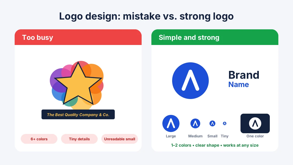
Before we look at mistakes, it helps to know the goal. A good logo is simple enough to be remembered, distinctive enough to stand apart from competitors, and flexible enough to work everywhere, from a tiny app icon to a large hoarding. It should also feel right for your industry and your customers. A logo does not have to explain everything your business does. It only has to be recognisable and trustworthy.
This is the most common error. Business owners often want to include everything: the product, the city, the founder's initials, a symbol, a tagline, and a decorative border. The result is a crowded design where nothing stands out.
A complex logo is hard to remember, and it falls apart at small sizes. Fine lines and tiny details disappear on a phone screen or a social media profile picture.
How to avoid it: Choose one clear idea. Strong logos are usually built from a simple shape, a clean wordmark, or a smart combination of the two. If you feel the urge to add one more element, ask whether the logo would still work without it.
A rainbow of colors might feel lively, but it makes a logo look chaotic and costs more to print. It also becomes difficult to use on different backgrounds.
How to avoid it: Stick to one or two main colors, and three at most. Make sure the logo also works in a single color, in black and white, and on both light and dark backgrounds. Color choice should be deliberate too, because every color carries meaning. Our guide on how color psychology influences branding explains what different colors tell your customers.
Trendy effects such as heavy gradients, glossy shadows, or the style everyone is copying this year can make a logo feel fresh today and dated in two years. A logo is meant to last for a long time. Changing it frequently confuses customers and wastes the recognition you have built.
How to avoid it: Keep your logo timeless and use trends in your campaigns, social media graphics, and website design instead. We cover which styles are worth borrowing in our overview of graphic design trends in 2026, and most of them are better used around your logo than inside it.
Decorative, thin, or overly stylised fonts can look elegant on a big screen and become unreadable in real use. If people cannot easily read your business name, they cannot remember it or search for it.
How to avoid it: Pick a clear, well-spaced typeface that stays legible at small sizes. Limit yourself to one or two fonts in the logo, and test it as a tiny version on a phone before you approve it.
A logo that looks great on a large presentation slide may be a blur on a social media icon, a pen, or a favicon in a browser tab. Many businesses discover this only after they have printed hundreds of items.
How to avoid it: Ask for the logo to be tested very small and very large. A good design should be recognisable even when reduced to the size of a thumbnail. It is also wise to have a simplified version, such as an icon-only or stacked layout, for tight spaces.
Free templates, stock symbols, and quick online logo makers are tempting when budgets are tight. The problem is that thousands of other businesses may be using the same graphics. A generic logo makes you look like everyone else, and in some cases it may even be too close to an existing brand, which can cause legal trouble.
AI logo tools carry a similar risk. They are fast, but the results can be derivative and inconsistent, and it is hard to know how original the output really is. We compare the two approaches in detail in our article on AI graphic design vs traditional graphic design.
How to avoid it: Invest in something original, and search for similar logos in your industry before finalising. A logo you can legally own and defend is worth far more than a cheap one you cannot.
A playful, bubbly logo may not suit a law firm or a hospital, while a stiff and formal logo may feel wrong for a children's brand or a cafe. The logo should speak the language of the people you want to attract.
How to avoid it: Start with research instead of taste. Who are your customers? What do they expect from a business like yours? What are your competitors doing, and how can you look different without looking out of place? In Mohali and across Punjab, local culture and customer expectations matter too, so a designer who understands the market has a clear advantage.
It is natural to want a logo that you love, but the founder's favourite color or style is not always what works for customers. Business owners also tend to ask friends and family for opinions, which can pull the design in several directions at once.
How to avoid it: Judge the design against the goals of the brand, not personal preference. Ask whether it is clear, memorable, and appropriate for the audience. A good designer will explain the thinking behind each decision.
This is an unglamorous mistake with expensive consequences. If you only have a small image of your logo, it will look blurry when enlarged for a banner, and printers will ask for files you do not have.
How to avoid it: Make sure your final package includes vector files (such as SVG, AI, or PDF) for printing and resizing, and PNG versions with transparent backgrounds for digital use. Ask for color, black, white, and icon-only versions. Properly sized files also help your website load faster, which is part of the performance story in our guide on website speed and Core Web Vitals.
If you can answer yes to most of these, you are on the right track.
Most strong logos use one to three colors. A simple palette is easier to remember, cheaper to print, and works better across different backgrounds.
Usually not. A logo should be timeless. Use trends in your marketing and website design, where they are easier to update, and keep your logo stable so people can recognise it.
For a temporary placeholder it can work, but free tools often produce generic designs that other businesses also use. For a brand that you want to grow and protect, a custom logo is the safer investment.
Ask for vector files such as SVG, AI, or PDF for printing and resizing, and PNG files with transparent backgrounds for websites and social media. It is also useful to receive color, black, white, and icon-only versions.
Consider a redesign if your logo looks outdated, does not work at small sizes, no longer fits what your business does, or looks too similar to a competitor. A careful refresh can keep recognition while fixing the problems.
A logo is a small piece of design that carries a big responsibility. Most logo mistakes come from trying to do too much: too many colors, too many ideas, too many trends. The best logos are simple, clear, and built to last, and they work everywhere your business needs them.
If you are launching a new brand or your current logo is holding your business back, the design team at Alien Web Solutions can help you create a logo that fits your business and your audience. Get in touch and tell us about your brand.