

Think about the last time you opened a new app or walked into an unfamiliar shop. Before you read a single word, you had already formed an opinion. It felt calm, or exciting, or cheap, or premium. Most of that feeling came from one thing: color.
Color is the first thing a customer notices and often the reason they stay or leave. That is why serious brands spend real time choosing their palette. In this guide, we look at how color psychology works, what different colors tend to communicate, and how businesses in Mohali and across Punjab can use color to build a brand people trust and buy from.
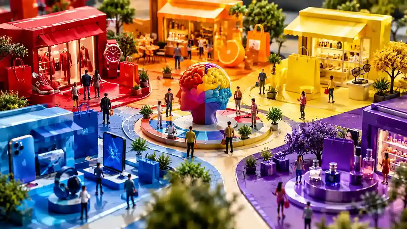
Color psychology is the study of how colors affect the way people feel, think, and behave. In branding, it means choosing colors on purpose so that customers get the right emotional signal the moment they see your logo, website, or packaging.
These reactions come from a mix of biology, personal experience, and culture. Red often feels urgent because we see it on warning signs. Green feels fresh because we associate it with nature. Blue feels steady because it reminds many people of open sky and water.
One honest note: color psychology is not a magic formula. The same color can mean different things to different audiences, and context matters a lot. But when it is used with thought, it is one of the strongest tools in a brand's toolkit.
People make quick judgments. A customer scrolling through search results or social media gives your brand only a moment, and color does a lot of the talking in that moment. It affects three things in particular.
Every color carries a set of common associations. Treat these as a starting point, not a rulebook.
This is where many businesses go wrong by copying global trends without thinking about their own audience. Colors do not mean the same thing everywhere.
In India, red is closely tied to celebration, weddings, and good fortune. Saffron and yellow carry strong spiritual and festive meaning. White, which signals purity in some places, is linked to mourning in others. In Punjab, bright and vibrant colors feel natural and welcoming, which is why many local brands successfully use bold palettes that a minimal Western brand might avoid.
If your customers are in Mohali, Chandigarh, and the wider Punjab region, it is worth testing how your palette feels to them, not just how it looks on a design trend board.
Picking colors should be a decision, not a guess. Here is a practical way to approach it.
Most of these mistakes come from treating color as decoration instead of communication. A trained designer thinks about why each color is there, which is a big reason why professional brand identity work pays off over time.
Yes, though it works alongside other factors like price, quality, and reviews. Color shapes first impressions, builds recognition, and can influence whether someone feels comfortable enough to click or buy.
There is no single best color. The right choice depends on your industry, audience, and brand personality. Blue suits trust-driven businesses, green suits health and growth, and red or orange suit energetic, action-focused brands.
Most strong brands stick to two or three main colors, plus neutrals. A limited palette keeps your branding clean, memorable, and easy to apply everywhere.
No. Cultural background changes how colors are understood. A color that signals celebration in one region can signal sadness in another, so it is important to consider your local audience.
Not automatically. Low sales can come from many causes. But if your colors do not match your brand message or clash with your audience's expectations, a thoughtful refresh led by a professional designer can help.
Color is never just decoration. It is a quiet conversation with your customer that starts before they read a word. The right palette can make your brand feel trustworthy, memorable, and aligned with the people you want to reach. The wrong one can send the wrong message without you even noticing.
For businesses in Mohali and Punjab, the best approach is to combine color psychology with a real understanding of your local audience, and then apply your choices consistently across every touchpoint.
If you are planning a new brand identity or want to refresh your existing one, the team at Alien Web Solutions can help you choose colors that look good and also work for your business. Get in touch to talk through your brand.